Saturday 29 September 2012

WHAT DO YOU SEE?


The Photographers' Gallery
http://thephotographersgallery.org.uk/home


A Single image on it's own with the opportunity to write your comments and thoughts on, good or bad. 

What do you see? 


This is the question that you are asked and I thoroughly enjoyed this 'mini project', which I thought it was and I thought it was a really good way of interacting with the Art. There were A5 pieces of card around for you to write on and then you could write away your opinions!
After you could choose to post it in box where your card is read and then maybe picked for the website. I will definitely be going back to this gallery, this being one of the main reasons.


Pavement Mirror Shop, Howrah, West Bengal,
Raghubir Singh, 1991


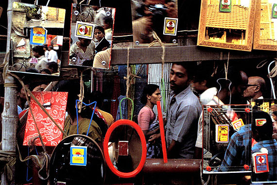
C- Print, Courtesy Succession Raghubir Singh
2 August-30 October 2012

Here is what I thought:


If you can't quite understand my writing, here it is again a bit clearer:
It's a busy street, full of people with many mirrors in the frame, which reflect the faces of the public and their surroundings. To me it represents culture and hectic lifestyles, and it makes you 'reflect' on how your own culture is different (to others). The main colour that stands out is the red, which could suggest a dramatic consequence.


After looking at the image again I think at first the mirrors are not that noticeable because I don't see them until I have looked at the people. I think it's quite an abstract piece and very impressionistic, it gives documentary and travel photography a little twist, repeating a few of the subjects and subtle 'images within images' hence the mirrors. It's quite an interesting image to look at, it really makes you think about it and it was a great photo for this exhibition.


Have a look at some others here: 
Or visit the gallery and write something yourself, it's fun!

Friday 28 September 2012

DISCOVER


WINCHESTER DISCOVERY CENTRE

'CITY SPACE'

WINCHESTER ART CLUB
ANNUAL EXHIBITION 2012
SATURDAY 1- SUNDAY 30TH SEPTEMBER


Images taken for my blog only and will not be distributed any other way


A lovely variety of artwork covers the walls of this small exhibition and I was pleasantly surprised at the mix of skill and creativity. The show demonstrates a love for all subjects, from nature to portrait, to landscape to abstract, the work was definitely aesthetically pleasing and it would suit all ages and anyone with an eye for art.


This exhibition is a great way to promote artists in the area, school and college students and more. I specifically enjoyed the landscape, water-colour paintings, as the detail and simplicity really pleases the eye. One of the main reasons I enjoyed the work on show was because it reminded me of my own work however now I prefer to make my images by
through photography. 


INTERNATIONAL GARDEN PHOTOGRAPHER OF THE YEAR-
 IMAGES OF A GREEN PLANET
www.igpoty.com


The exhibition space was light and spacious and straight away I was blown away by the beautiful images in front of me. I am a huge fan of garden, flower, nature photography of any kind and I was very pleased to have found out about this exhibition as it was definitely worth seeing. It really must have been hard to decide a winner for all categories as they were all worthy winners in my eyes. The colours of the flowers filled the room and brought the white space to life particularly the strong macro shots.


The were photographs chosen by The Royal Photographic Society which must have been an honor even for second and third place. There are many photography exhibitions of contemporary and conceptual focuses and they give people a mind-boggling experience, going away thinking what was that all about? But going into this one gives you a totally different experience, and one you have to talk about, and clearly.


The first category is: 
Trees
This category focuses on the importance of trees' in our lives and their beauty.


Don Johnston, finalist
'Birch Trees and foliage in spring'
Greater Sudbury, Canada
Nikon D3, Nikkor 80-200mm, 1/80 sec, f/6.3

The white birch is a common tree in that area, the foliage is from saplings nearer the camera,  he likes to make impressionistic images of common things and he has focused on the tree trunks using a wide aperture and kept the foliage evenly distributed. 
You immediately get a burst of colour in your face and you have to look more closely to find your way through the green in the foreground. This image is interesting in terms of the abstract focus and is a different way of making something simple so much more exciting.


 Category:
Wildlife in the Garden


Kin Corning
'Robin in the Forest' (top right)
Nikon D300 200-400mm, 1.4x teleconverter
1/200 sec at f/5.6, slightly cropped


Taken from his home garden in Surrey, this image stood out most out of the four, just because of the crispness of the branches and the snow. The Robin really is the favourite of the garden and his pretty red breast stills the show here.


Category: 
Plant Portraits


Mandy Disher 1st Place
'Choca Mocha'
Canon 450D, 60mm Macro lens
1/125 secs at f/3.2

In this image the focus clearly was to accentuate the amazing rich colour of the flowers and the textured petals. This was one of my favourites because of the contrast of the foreground and background and how equally important it is to get the balance right. Mandy Disher has complimented the flowers well  and deserves the place she got.


Category:
Garden Views


Charles Needle
Morning Splendour
Georgia, USA, Callaway Gardens
Nikon F4

Situated in a 12 year old, 40 acre public garden, the beautiful pink explosion emphasizes this garden and it's flowers and the mist surrounding the area just highlights the beauty even more. Needle has made a lovely composition and was a real pleasure to look at.


Plant Portraits


John Grant, 1st Place
Fairytale and Reveries, Studio
Canon 5D Mark 11

These creative, expressionistic and abstract prints were unusual but very intricate and pretty. There were six images in total but these were my favourite and although they were taken by a top of the range digital camera they looked very traditional, like they had been taken on film. I think thats what gave these images the edge over the others in their category. A Stunning set of photographs, with subtle, de-saturated colours that catch your eye.


Same as above


Category:
People in the garden


Jason Ingram, 3rd place
The hands that pick the food that I eat, 
Bristol


The black and white photographs on their own separate wall portray a great message and  they are really expressive and detailed. The close up of the hands and the food is simple but conveys and makes the story more understandable. 

This exhibition was well worth the journey!


DAVE MCKEAN: A RETROSPECTIVE


DAVE MCKEAN: A RETROSPECTIVE


THE WILLIS MUSEUM
BASINGSTOKE


Dave Mckean is an award winning artist of Illustration, photography, graphic design, film-making and music. He has many Illustrations that feature in graphic novels and books and in 2005 he co-wrote and directed the film, "Mirror Mask", with Neil Galman. (below)


Mckean was a conceptual artist in two of the Harry Potter films and he designed album covers for Alice Cooper, John Cale and Michael Nyman.


Harry Potter, Dementor


The exhibition includes framed works of his book Illustrations, Original comic book art, photographs, Album covers and personal projects. My first impressions of the work was that it seemed and felt quite dark and troublesome, it demonstrates a high level of creativity and imagination and I did grow quite fond of it after viewing it all. I particularly became drawn to the mixed media pieces rather than the illustrations, as they seemed to have a bit more life and colour. His traditional techniques and materials really emphasize his style and give an element of personality to the work. 


Dave Mckean has an Award for World Fantasy and Best Artist 


Apart, and yet a part
Bill Bruford's, Earthworks, 1998
Acrylic, photography, collage, digital image


From Taplow, Slough, Berkshire, featuring his work, here in Basingstoke makes you feel a little more fond of Mckean and his work because of his roots and the idea that someone with this amazing career in the art industry has been so successful.  I think the interesting and quirky drawings and graphics make you think about your childhood and all the fantasies you once had or still have and I think it makes art extremely pleasing to view like this.


Dave Mckean: The Particle Tarot: The major Arcana


His work incorporates drawing, painting, photography, collage, found objects, digital art and sculpture. Being so versatile and skillful in so many areas must have made his mind clearer in how he would use his artistic ability, his work has attracted people from all industries including the film and music industry which makes him really versatile.


Illustration: Tap, frog and flower
Black Orchid #1, 1998, Acrylic


Mckean has published four books of photography: 
  • A small book of black and white lies, 1995
  • Option: click, 1998
  • The particle Tarot: The Major Arcana
  • The particle Tarot: The Minor Arcana


Cover Design, Hell Blazer
Collage, acrylic, pencil, ink and stones


In some of Mckean's work there were random materials applied, for example a fish in one piece, and the image above demonstrates use of stones. This may appear very different to some people viewing the art but others, maybe more familiar with fine art may think this as experimental. For me I felt it added another quality to the work to make it that bit more exciting and interesting. I can relate to this work in a way because it's how I worked at college when I studied in Fine Art, I was very much a mixed media artist and I would still work that way being it's definitely more expressive.


Heart Strings and Watch Stops
Mister X, 1989, Ink


The exhibition has finished now but if you're interested in seeing more work visit this website:

Thank you for reading, feel free to comment!