Wednesday, 14 March 2012

THE HOLBURNE MUSEUM


Art of Arrangement: Photography and the Still Life Tradition
11 February to 7 May 2012 


This exhibition explores the use of objects within a Still Life and how Artists and Photographers have experimented with techniques and ideas over many years. It holds the works of Artists/Photographers, such as Ansel Adams, Edward Western, Dorothea Lange, Paul Strand and many more masters of the Art world.
It was fascinating to see such rare and one-of-a-kind prints in one room and to have this opportunity that might not come again.

I have chosen particular pieces of work from each section of the exhibition which will be underlined and these were the ones that I drew my attention to aesthetically and technically. However the images were not allowed to be photographed close-up and some are not found online either, obviously for issues of preservation etc..


View of the Gallery


On Close Inspection
William Henry James Coombs, Negative radiograph of Tulip
(Gelatin Silver) Unfortunately no image.
A radiograph is an image produced on a radiosensitive surface, such as a photographic film, by radiation other than visible light, especially by x-rays passed through an object or by photographing a fluoroscopic image. Also called shadowgraph, skiagram, skiagraph.


For example: 

Floral Radiograph of a Rose produced by Albert Richards
 Floral radio-graph, produced by Albert Richards


Arrangments in negatives
The grouping and positioning of different parts of a photograph.
The images displayed are very unique in style and demonstrate technical ability and creativity and are very artistic. Now knowing how these images were produced makes you aware of the skill and time put into each one.
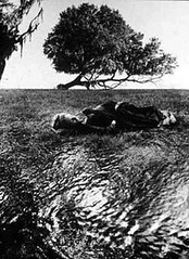


 Jerry Ulesmann, Memory and the sun,1966

 
Henry Peach Robinson, Fading Away, 1858
(Used several negatives to produce one photograph)


Still Life in a camera
The passing of time, fleeting nature of life, particular arrangements, carefully positioned equipment, framing and cropping.
The work is quite abstract and relates more to "Art" photography compositionally and aesthetically because of the way it's constructed. You are given the opportunity to explore the image further into detail by cropping from a much varied image.
Edward Western, Detail of Abandoned Car, Mojave Desert, New Mexico, 1937


Ansel Adams, Moth and Stump, Interglacial forests, Glacier Bay, National Monument, 1949

Reflection on light and dark
Photography and light
Natural and artificial
This work is quite experimental in terms of lighting and it's interesting to see how one interprets different settings and objects with different ways of light. Light can illuminate, highlight, accentuate or alienate a subject depending on the situation and the artists' intentions.

Paul Strand, Photograph-New York, 1916


Order and Disorder
Objects carefully selected and ordered to create a visually pleasing or meaningful image.
This sort of work makes you wonder whether you could call it "staged" photography or unrealistic, however I feel if you use the objects that belong to that particular space you are not manipulating the scene or reality in any way as there hasn't really been any interference. 
James Jarche, George Bernard Shaw's work table, 1939
Ian Beesley, Pieces, Drummond's Mill, Bradford 1986
Dorothea Lange, Corner of the Dazey Kitchen, 1939


Still life with the figure
Human figure is not the primary focus, important part of wider arrangement
Illustrates personality or artistic practise, or symbolic, meaningful things.
These images are very beautiful and the artist's have been very subtle in their approach to using the figure within their work. In some of the photographs there are only hints of a person whereas others have a face of the body, representing or meaning something as part of the image.
Chris Killip, Royal Wedding table, 1981
 

Horst P Horst, Gloves, New York, 1947

 
Julia Margaret Cameron, The Return After 3 Days


The Subversive
Records events, mortality, passing of time, political or personal messages.
Jo Spence, Still Life, 1985
Spence documented her body ans surroundings during her treatment of cancer, it was a sense of self which she then coined the term, "photo-therapy". Her work is very inspirational and political and sends messages to everyone who may have gone through similar experiences as herself.
Karen Knorr, A young nobleman's introduction to knowledge, 1984
This work was specifically about country life and the British class system.


A Dialogue with painting
"Vanitas" 
These paintings contain a moral or religious message, a shortness of life and inevitability of decline and death. They also contain long exposures of time with the still life being ideal to represent this.


Roger Fenton, Still Life with parian vase, Grapes and silver cup, 1860
The painter is mirrored in the goblet, were these his intentions, or just a happy accident? 

Movement and Stillness
They freeze a moment in time, stop and reflect and show action.
Cutting the Card Quickly .30-Caliber Bullet through the Jack of Diamonds

Harold Edgerton, Bullet through a jack of diamond, 1955


Philippe Halsman, Dali Atomicus, 1948

The iconic image of Salvador Dali is questioned by many at how this piece was constructed and seeing it for the first time allowed us the answer to just this.
The objects were suspended by thread, with the help from an assistant that held the chair and everything else thrown into the air, all very spontaneous. The whole production took 6 hours with 28 throws. The final image was the only successful one out them all.

The Holburne Museum in the City of Bath and the exhibition, "Art of arrangement", is definitely worth going for.


Friday, 9 March 2012

SUBMISSION


My Work Exhibited!


I have recently explored the website and blog of Lenscratch which holds free exhibitions for anyone, which is an amazing opportunity and I aim to do another one.
Below is my entry to the website's "Animals" exhibition that will be held, April 3rd 2012. This image was taken in Worthing, West Sussex.


'We need coats'

I thought this image really captures the sheep's expressions and I think the shot has frozen a great moment where they are looking at each other as if they are communicating. This proves Henry Cartier-Bresson had a point with his theory, 'The decisive moment'. This is also why I love the quote myself.

The site features work and information on contemporary photography and has links to other exciting websites.

Monday, 27 February 2012

MONSTERS OF THE ID


David Cotterrell: Monsters of the Id
11 February- 31 March 2012
John Hansard Gallery
University of Southampton 

John Hansard Gallery is one of the UK's leading public galleries of contemporary visual art. Based on the University of Southampton's Highfield campus, it showcases the work of some of the world's most innovative artists and curators through exhibitions, off-site projects, national and international partnerships, research, publications, education and outreach programmes. John Hansard Gallery is part of the University of Southampton and supported by Arts Council England. www.hansardgallery.org.uk


David Cotterrell is an installation artist who works with various types of media, from video, audio, interactive and intelligent technology. He is Proffessor of Fine Art at Sheffield Hallam University and is represented by Danielle Arnaud Contemporary Art, London. www.davidcotterrell.com

Monsters of the Id, derived from the artist's journeys to Afghanistan, explores the illusionary nature of representations of war. Although influenced by his experiences as an artists within a conflict zone, David Cotterrell avoids the drama that is usually witnessed in the media and deliberately takes a more subtle approach to his work.


David Cotterrell, Observer Effect, 2012


Exploring the different rooms set out in this small gallery, it was instantly recognised that they all had something in common and could even be connected somehow. The first room, named, the "Observer Effect" consisted of a panoramic type projection and interactive and virtual land in front of us that seemed to be affected by our presence and immediately we become part of that piece. As we remain stood in front of this landscape, the sensors above detect the number of people and a population of anonymous "avatars" appear in front of us and they grow in number. The work seen throughout is synthetic and explores the idea of viewer to content rather than viewer to Afghanistan.


David Cotterrell, Searchlight 2, 2012


Moving into the "Searchlight 2" room we experience a low platform terrain derived by a tonne and a quarter of chalk, and then allowed the chalk to define its' shape and "fall as it felt". The population witnessed in the "Observer Effect" are generated from the screen and migrate onto this landscape, mirroring the actions seen previously. This terrain has been 3D scanned and used throughout the exhibition which juxtaposes each displays. The sky and the movement however are created in real time and the direction of the avatars is completely randomized and there's no telling of the decisions they will make.


David Cotterrell, Apparent Horizon, 2012


The "Apparent Horizon" is inverted hemispheres that explore the idea of the waiting and searching of information experienced by a soldier, civilian or observer. It again correlates the same landscape projections from the other rooms but here the sky dominates. The display is similar to that used within military simulation. The walls are concave creating an extraordinary optical illusion.

David Cotterrell explains that the technicality remains as invisible as possible and he tries to create a dialogue between artwork and the viewers. When Cotterrell shows the technical aspects of the exhibition we are experiencing the paths that the characters choose to follow, represented by a green line. He tells us that the paths are easily accessible and they lead them towards us and that's how they find their way, exploring how they make decisions without any particular rules. Cotterrell made the choice to eliminate sound and not include photographic backgrounds for the reason that it would cause distraction on the interacting characters and the engaged projection.


David Cotterrell appeared open about his work and also himself as an artist. It was interesting to hear an artist speak about the experiences he went through to produce such an interesting piece of work. He quotes,

"It was like learning a new language, I watched myself struggle and I could've know more about it"


DEFINING TERMS


Coming to terms with relevant words...
There are some words that are important to the subject of Art and Photography and here is a couple that spring to mind!

Allegory and Metaphor are used every day and especially in the arts to express the obvious without being too literal. Artists use these terminologies/ terms to start thinking about the differences between them and how images can represent them in various ways.

It became apparent that I had never come across the term allegory/allegoric and it was very interesting to explore its' meaning fully. A metaphor is a very challenging but creative tool which is used to create multiple concepts within an image or piece of writing. Looking at the work of Sarah Lucas and Simon Patterson helped to analyse these terms and gain a better understanding of them.


 Sarah Lucas, "Self-Portrait with Fried Eggs" 1996

Here you see Lucas slouched and quite confrontationally posed in this seat which immediately suggests a male presence in the room. Linking the fried eggs and position she's in you get the feeling that this is metaphor for "looking like a man". Her clothes also suggest "masculinity" and like many others, the first thought when viewing this image was that she was a man. Another suggestion was that the floor was also placed deliberately underneath her, like a makeshift kitchen, stereotypical of a woman perhaps? The idea of this exercise was to pick the image apart and make sense of it in a more analytical way, instead of just looking and then moving on, you look deeper into all the different objects and find your way round it.

More work by Sarah Lucas visit:
http://www.tate.org.uk/servlet/ArtistWorks?cgroupid=999999961&artistid=2643&page=1


Sarah Lucas, Au Naturel 1994 Mattress


It is clear that Lucas refers to the male and female genitals, quite expressively with the use of fruit and a fire bucket. Although you don't see the male and female physically in the room, your mind automatically tells you, through experience (semiotics, http://www.aber.ac.uk/media/Documents/S4B/semiotic.html)
that these are in fact male and female representations. These representations are visually allowing your imagination to wonder around the subject of male and female roles in a relationship. It could also represent a more open and erotic representation, for example prositution. This image is meant to represent married life, and is showing you the reality of what's to come, a few years down the line.


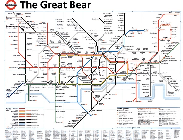
Simon Patterson, 'The Great Bear’, 1992


This image at first glance looks like a reproduction of the London Tube map, which in a way is, but with a subtle twist. The names on the map are those of famous people, some being artists, actors and musicians, these were on the forefront of major world developments. The different professionals are given their own tube lines, on which their names are gathered. The name "The great bear" represents a constellation of stars in the sky which are simple and an effective title for this piece of work.
for a clearer view of this image and more information.

CHARLOTTE COTTON


Story Telling

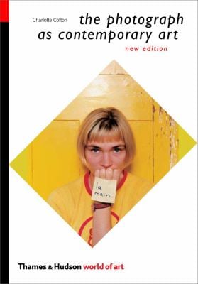
Charlotte Cotton's, "the photograph as contemporary art", which I now own has been a recent topic of discussion.
The pages specific to this discussion are 64-70 in chapter 2, "once upon a time".
Another blog featuring this particular chapter: http://imagingworkshop11.blogspot.co.uk/2011/01/reading-charlotte-cotton-once-upon-time.html

You can buy your copy from: 


What narratives are investigated by Cotton in the work discussed? What varied ideas are these works linked to?
Collected fears and fantasies, psychological powerful devices, childhood references and stories usually dramatized and given sinister edges, storytelling gone wrong in most cases. Some had troubling narratives but were linked to fashion. For example animals, birds, rituals, bizarre and disturbing psychological dramas.


untitled #2 (wonder)

untitled #2 (wonder), 1996. Chromogenic print, A.P. 2/2, edition of 5, 47 5/8 x 39 5/8 inches (120.8 x 100.6 cm). Solomon R. Guggenheim Museum, New York,Purchased with funds contributed by the Young Collectors Council  97.4577. © 1999 Anna Gaskell- 

These were all quite disturbing to look at, especially with the involvement of children, and the fact that their childhood memories of fairy tales and adventures were being totally transformed into sinister alternates of similar stories. I thought this could be the result of an unfortunate child who is rebelling at the idea of happy childhoods and would like to express their hurt and anger for not being able to experience what normal, happy children would experience. Or not even the child itself but a cry out for those who are victims of these experiences. I feel as if these images would not appear into someone's head without having some sort of recollection of the ideas around the subject, they are very powerful and effective however troubling and worrying views come to mind when viewing them. 


Artwork by Gregory Crewdson, "Twilight" 2002
Untitled, 2001
Digital C-print
Image size: 48 x 60 inches (121.9 x 152.4 cm)

 The use of sets and props compared with location and the environment, children as the subject and fashion models. Fashion and costume is frequently used with the references from stories which are extremely exaggerated. Landscape and Portrait photography and some combined together, also interior/architecture and perspectives and angles. The photographers reference film and fiction most in their work along with mild horror and Sci-fi. They use real people and children to create fake and unrealistic scenes and they exaggerate the things we most fear in the past and the future. For example the work above by Gregory Crewdson is very staged and fictional but there is an element of beauty within its' context. It's a very mysterious and intriguing body of work that again captures the essence of the paranormal and disturbing. Either way the images are very captivating and would have taken some time to produce.


Work made by Charlie White, "Ken's Basement", 2000

Contemporary is a very open term and can be discussed in many ways however I see the word and work relating to it, new and exciting with challenging and sometimes controversial aspects to it. Work in this genre can be visually striking with powerful meanings and there will always be new work emerging to back up a new and interesting idea. Photographers under this term use their experiences and personal references to express themselves and through their work. Contemporary doesn't always suggest modern but is something that's new to the art world and is there to provoke discussion and analysis. Some people would argue that contemporary art/photography is too different and hard to understand, but if everyone produced the same photographs in the same way you would get bored looking at it.


CHRISTOPHER STEWART United States of America 2002 
c-print
40 x 60 in / 122 x 152.4 cm


Does not liking a piece work make you disregard it completely? What happens if you pick a photograph/painting to pieces, would you discover a hidden meaning that you do prefer?

Tuesday, 7 February 2012

TAYLOR WESSING PORTRAIT PRIZE


THE NATIONAL PORTRAIT GALLERY-LONDON

Tuesday 31st January

Follow this link for the National Portrait Gallery website and more information:


This exhibition was in relation to my "Representation" project (on portraiture). It also contributes to my exhibition reviewing for visual exploration.
A very interesting and thought-provoking exhibition on contemporary portrait photography, and although there were works that didn't grab my attention, there were many that were stunning, and they were the ones that for me told a story at first glance. I have chosen one the winning image to sum up the exhibition as it stood out for me most.

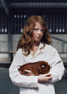
Taylor Wessing Photographic Portrait Prize 2011

Harriet and Gentleman Jack, by Jooney Woodward, has won the Taylor Wessing Photographic Portrait Prize for 2011. Photograph: Jooney Woodward/PA.

This piece is very striking and immediately shows character and depth. Her work is taken in film, which was seen as unusual at the exhibition, however I think it gives certain uniqueness to photographs that you can't get with digital. Her red hair and the juxtaposition of the Guinea Pig is dominating the image, against the white overalls, it really shows that the two characters are as important as each other.

 "I prefer the quality and depth you get from using film; unfortunately it's a dying art."-Woodward.

The picture was taken with a Mamiya RZ medium format camera, which I am currently learning to master at University. Our portraiture project is based around medium format, so this image is a huge inspiration.

"I don't mess around with Photoshop so what you see is what you get. Enhanced images can portray a false sense of reality, whereas my work celebrates the people and places as they appear every day," she said.


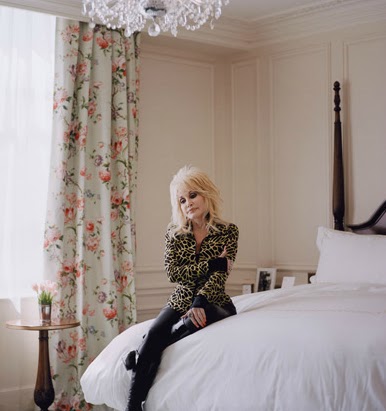
Dolly Parton by Zed Nelson, 2011 © the artist


Andie

by David Knight © the artist

His portrait of 15-year-old Andiee Poetschka, was commissioned
 by Loud for the Cerebral Palsy Alliance to raise awareness of the condition throughout Australia. He says:

‘I wanted the portraits to be positive and to convey the kids in an uplifting way
 You don’t immediately notice Andiee is in a wheelchair; you just see a
 beautiful young woman. The image doesn’t demand you look at it, but gently
draws you in.’

(Information taken by The NPG website)


Wednesday, 1 February 2012

WAYS OF SEEING


John Berger’s 
“Ways of Seeing”

In photography it's not all about the 'photo' but there's a deeper meaning to all photography and Art in general and one person who discusses theoretical meaning is John Berger. Here is a discussion on a few pages I recently saw from his book.

This chapter is purely images, no text, which at first was slightly strange as I am used to seeing images with text alongside. The text you usually see, normally informs you about the narrative and opinion about that particular image, but here, John Berger has included 14 pages with no information.

After looking at these images for a while I decided to take a look at John Berger’s BBC documentary, “Ways of seeing”, which I thought may give me some ideas and thoughts around this piece.

The following images are from the chapter I will discuss.


No text, Just image?

Berger may have done this to give the viewer an opportunity to read the images on their own accord and not be manipulated by a piece of text that decides for you. I thought that including text may change the significance of the image and “manipulating” its’ concept. Berger states that “pictures are like words”, “the images speak for themselves”. During the documentary Berger shows a “reproduction” of an image, to a group of primary school children and asks them to look and explain what they see. 


The result being quite diverse and strangely, the boys thought the person was a man and the girls, a woman. They all had their own opinion on this painting and came up with their own ideas and I think that’s very important when making your own work, whether it’s necessary to include text or your interpretation straight away to avoid the viewer being too restricted.

Why can’t viewing art be more spontaneous?


Narratives? 

The idea of male and female roles in society during the 16-1800’s, power and wealth, culture and social status and the depiction of women.  Most of these images were oil paintings, mainly during the Renaissance, some earlier, some later and it was evident that the portraits within them were of high status and considerably wealthy. Some emphasise the dominance in the male figure with the women as house-wives or maids. 


There were a few images of animals that suggested possession and ownership and most importantly the images of women could be a little provocative or a little exaggerated In terms of the female figure. John Berger argues that in European art from the Renaissance onwards, women were depicted as being “aware of being seen by a male) spectator”. This explains the poses and the styling of the women in the paintings and how they were almost always seen, as nudes.

Similarities and what period in history? 

The similarities of the images are that they were either during the Renaissance or later, maybe earlier. They are of a very classical style, some biblical, some of historic relevance, and they represent the women quite frequently. The nudes of women were generally seen as beauty and a “form of dress”, or a “display”, “disguise”. The oil paintings, specifically the biblical ones were often representing eve as being punished, the women was always seen as the “weak” or “vulnerable” and this could also be the answer to why women were nude and men were dressed, the male was superior over women.


 In Berger’s documentary he suggests that women were normally depicted by a (male) painter for the viewer’s pleasure. The images are quite expressive and the paintings exaggerate certain subjects, “paintings were to be seen, not hidden”, it was the “idealism” of that time. There are emphasises on wealth and culture, “how the other half live”, and these were represented with animals, huge amounts of land, portraits of maids and servants and family portraits in quite extravagant clothing. The slave trade is also represented in a few images and these would probably be shown in a newspaper at the time, documenting an event.


Can the readings of these images change over time? 

The readings of these images would change over time, and we thought that our ideas on history and religion would change from person to person and we can see how exaggerated paintings were of the depictions of the world. Also the images of the slave trade would have been seen at the time in newspapers to document these events and now we see it as a historical document, something that we now learn about. 


Education, advertising, modern art has changed our perceptions of things, and traditional art is now something we admire rather than producing more of that style of work. The images with the wealth and social status is an insight to the way they lived and that has changed a considerable amount, what we think of social class now is completely different, these images are now historical documents and insights to a society that doesn’t exist anymore.